Below is my response to Question Four on the evaluation.
Showing posts with label Sophie Avci. Show all posts
Showing posts with label Sophie Avci. Show all posts
Wednesday, 21 March 2012

Tuesday, 7 February 2012
A2 ADVANCED PORTFOLIO: REFLECTIVE EVALUATION (Sophie Avci)
QUESTION THREE
After showing our completed music video to our A2 media class, they filled in some audience feedback sheets (posted in previous blog posts) giving us their opinion on our video and the strengths and weaknesses that we can work on. Our class does contain mixed genders, meaning the audience feedback sheets were not all done by our target audience of females.

 |
| Our Variety of Camera Angles |
Although the majority of the comments received were positive, one feedback sheet had a lot of negative comments such as 'it was difficult to watch'. We know that our music video will not be perfect as we are not professionals however we did make sure we had a lot of variety in the video, from camera angles to narrative ideas, so I think that our video was simply not enjoyed because the person does not like Kimya Dawson's music and anti-folk is not a genre he/she particularly likes.
 |
| 'I'll show you who's the best' |
During the actual making of the video we did ask for some audience feedback so we could alter some of the video to meet audience's needs. One section where we did this was on the princess bit where Rosa is on the bed saying 'I'll show you who's the best'. Originally we were going to have the sound down on this part and sync it so it fit with the soundtrack, however when we played it to a group of people with the sound up, they said they much preferred it with Rosa actually speaking over the soundtrack. By getting people's opinions during the production process we can alter our music video to make it more suitable for the audience.
Overall, I feel we had fairly positive feedback and I am pleased with the outcome. I think, however, if we had gathered audience feedback from a more wider unknown audience then we would receive more critical opinions as they would give their honest thoughts to the video.
A2 ADVANCED PORTFOLIO: REFLECTIVE EVALUATION (Sophie Avci)
QUESTION TWO


-VIDEO: Sepia on the narration parts. Countryside looking locations.
There are a lot of things that are present in more than one of our three products, some of these being:
-Rosa - as she is the artist we wanted to have her in all three products so the audience recognises the artist straight away.
-Costume - we decided in every photograph to have Rosa in the same costume to show continuity, however we did have a different costume for part of the video to show another day in Kimya Dawson's life.
 When creating each product, we wanted to make sure they interrelated so on the Webpage we had a section that mentioned the CD album and also 'The Competition'. By using synergy, it helps promote the music video through other media but is seen by the same target audience which is even better. All three products which we have created have the same purpose in the sense that they're all wanting the target audience to listen to the music video. We have done this by telling the audience to watch the music video (WEBPAGE), having the track on the album (CD COVER) and when the audience see our music video hopefully they'll become interested in the artist therefore frequently revisit the Webpage


Above are our completed Webpage and Digipak.
One thing we made sure we did when creating our project was keeping a continuous theme throughout. The choice of colours (beiges and sepia tones) has stayed the same throughout each section, for example:
-CD COVER: Brown wood on acoustic guitar. The beige colour on the doodled background. Natural colours in the photograph.
-WEBSITE: Natural colours in photograph (plants, Rosa's hair). Beige doodled background. Brown coloured font. -VIDEO: Sepia on the narration parts. Countryside looking locations.
There are a lot of things that are present in more than one of our three products, some of these being:
-Rosa - as she is the artist we wanted to have her in all three products so the audience recognises the artist straight away.
 |
| SAME LOCATION AS CD COVER |
-The location - same location on the CD Cover, the website and the ending of the music video. We decided to repeat the location to show that its a personal place of Kimya Dawson's where she likes to hang out.
 |
| DOODLE |
- The doodle - which Jacques and I drew ourselves, has appeared on both the CD Cover and the Website. By doing this it looks more professional and shows that Kimya Dawson has a specific look that makes her unique. When looking at Kimya Dawsons website, there is also animated images so we have kept Kimya Dawson's personality in our products.

 When creating each product, we wanted to make sure they interrelated so on the Webpage we had a section that mentioned the CD album and also 'The Competition'. By using synergy, it helps promote the music video through other media but is seen by the same target audience which is even better. All three products which we have created have the same purpose in the sense that they're all wanting the target audience to listen to the music video. We have done this by telling the audience to watch the music video (WEBPAGE), having the track on the album (CD COVER) and when the audience see our music video hopefully they'll become interested in the artist therefore frequently revisit the Webpage
 and listen to all the tracks on the CD. As well as in our own products, we have also used synergy in our music video when the youtube section comes up with all the comments. Although we didn't intentionally have this section to help promote youtube, it shows that some of Kimya Dawson's videos are on youtube for people to see.
 |
| Handwritten Font |
I think overall, our Webpage, CD Cover and Music Video will definitely be liked by our target audience of teenage females. We have done various thing to aim our products to this audience such as keeping the theme quite feminine with the doodled background and having the main character as a girl so its easy to relate to. More technical aspects such as the main font (Beautiful Every Time) and our handwritten font on the Webpage are very curly and girly, and slightly animated like the font seen on Kimya Dawson's albums. Although the costume is pretty much the same throughout the video (it's the same on Webpage and CD Cover) there are a few different costumes such as the princess outfit. This costume was used, along with fitting to the lyrics, to suit our target audience of females. By having these sort of costumes, it expresses Kimya Dawson as quirky and girly which is what her music is usually described as.
 |
| Princess Outift |
 |
| We had the same location in the CD Cover, Webpage and Music Video - shows Kimya's personal favourite space |
 |
| This is Regina Spektor's webpage. In similarity to ours, its simple and unique. Although anti-folk artists are not all similar and infact dwell on the fact that they are individual, they all share one thing which is: they express their uniqueness through their image. From looking at Regina Spektor's webpage we can see how although she has displayed her individuality differently to Kimya Dawson, there are still some similarities. There is a picture of Regina on the homepage which shows the audience who's fanpage it is and makes it more personal. Also, similar to our music video, Regina Spektor's website promotes her album at the top of the page to catch the audience's attention first. |
 |
| This is Regina Spektor's album. Like our album, it is continuous with colours as it has stayed with the blue and grey colour scheme on both Regina Spektor's Webpage and CD. Like ours, it has the artist and their instrument, however Regina's is in animation whereas ours wasn't because we wanted the audience to recognise the artist at first glance. |
 |
| This is Kate Nash's CD and I think it's very much similar to ours. It has a countryside looking location, like ours and also has the artist on the front cover. To keep with quirky theme, the font used is very child like which also suits the target audience of female teenagers. The image is the main foreground which makes it more interesting to look at, however I think that the artists name should have been slightly bigger like ours to show the audience who the artist is straight away. |
 |
| Unlike our webpage and CD Cover, there seems to be no continuity in the theme apart from the font used on the artists name. I don't like this idea, as when I first clicked on the website I wasn't sure whether I was on the official page or not. I think by having a continuous theme, whether its the same background or the same colour scheme like Regina Spektor's, it makes the artist more recognisable to the audience. |
 |
| This is Kimya Dawson's album 'Alphabutt'. Compared to our Kimya Dawson CD, this is very dissimilar as our CD cover was a photograph rather than a drawing. The 'cute' handwritten effect on the font is very much like ours as it adds a feminine personal effect to the CD cover. When we originally looked at this album in the beginning, we liked how the title was written in the sky, so when we created our own CD cover, we did the same. It prevents an overcrowded look that can be too busy to look at. |


 |
| After Kimya Dawson's original website got hacked, a new one was created. Although this means we cant compare our webpage to the original one we were using for inspiration, we can compare it with the updated version. Similar to ours, it has an animated background which represents Kimya as a fun and carefree artist which is what we were going for. Although this webpage is much brighter than ours, it's simple and easy to navigate round like ours with the links at the top of the page. We also had the name of the artist at the top of the webpage so the audience knew immediately who's wepbage we were on. |
The internet has been a big input in our project and we have used it mainly for promoting our products, such as using youtube to display the video and obviously a webpage would be shown on the internet. Without the internet, it would be difficult to get people tosee our music video as we have used youtube as well as social networking sites to pass on the URL. In addition to this, we have used Blogger to keep all our thoughts and ideas in the process in an organised way.
THERE IS FURTHER ANALYSIS INTO CD COVER ANALYSIS EARLIER ON IN MY BLOG POSTS. - http://a2blockbbecysophiejacques.blogspot.com/2011/12/a2-advanced-portfolio-reflective.html
Friday, 3 February 2012
A2 ADVANCED PORTFOLIO: REFLECTIVE EVALUATION (Sophie Avci)
QUESTION ONE
 The three videos above are:
- Our completed music video of The Competition by Kimya Dawson
- The official music video of ‘Us’ by Regina Spektor
- The official music video of ‘Foundations’ by Kate Nash
As there are no official videos for Kimya Dawson, I will be comparing our completed music video with two videos from the same genre which is anti-folk. Some of Kimya Dawson's music is actually on the soundtrack for the film 'Juno' by Jason Reitman. This means that the film was most likely aimed at the same audience as we are trying to aim for.
 Although Kimya Dawson is a unique music artist, there are some similarities between our video and the official music videos of other artists from the same genre. The use of stop motion is in all three videos although its used differently in our video compared to the others. We decided to use stop motion twice, once where Rosa was looking in the mirror and the words ‘fat’ ‘ugly’ and ‘stupid’ appear on the mirror and then straight after this section when the false tears are on her face. We did this by filming three separate parts, each for 3 seconds so we had enough footage to crop when editing. The first part said ‘fat’ on the mirror, the second part said ‘ugly’ on the mirror and the third said ‘stupid. To make it look effective we had to make sure Rosa stayed in the same place otherwise it would jump and the focus would then be on Rosa rather than the mirror. The stop motion in ‘Us’ had a slightly different effect as it was meant to look unrealistic and slightly animated whereas ours needed to look fairly realistic but still quirky. We felt this technique went well, however my personal opinion on the tear section was that if we had more clips in this part so they were shorter in length, it would have looked much better and less amateur.
After watching many videos from the anti-folk genre, we noticed that a variety of shot types were used, from long shots to close ups. When creating our own music video, we decided we also wanted to follow this convention to make the video more interesting to watch and to prevent repetition. In the music video 'Foundations' we really liked the close ups (for example, when the two characters hold hands) so we tried to incorporate a few close ups of Kimya Dawson such as when she closes the door right at the beginning. In the official music video of 'Us' by Regina Spektor, we really liked the high angle shot of Regina playing the piano (PICTURE ABOVE LABELED 'US - ANIMATED STOP MOTION) so we decided we wanted to experiment with a range of angles in our video. We also noticed that in the majority of Regina Spektor's music videos she would play the piano when a piano was actually heard in the music. We found both of these techniques interesting so combined the two, for example when Rosa is on the bed, we included an instrument (acoustic guitar) and took the shot from various angles to make this section more visually exciting.
Although the anti-folk genre doesn't apparently have any specific conventions as it is more about the individual artist expressing themselves as unique and rebelling against ideologies and major labels, there are many aspects of the anti-folk artist that are seen in practically all of the music videos in this genre. Usually there is some form of instrument, and as Kimya Dawson is always seen with her guitar, especially at her concerts, we thought it was appropriate to have an acoustic guitar in the music video. The lyrics of an anti-folk song are usually very narrative, so many of the videos (especially Kate Nash) centre on a story that is expressed in the lyrics. As we had chosen a song with a strong narration, we decided to portray the story, for example when the line ‘when I worked in retail they said I was a slob’ was heard, we showed Kimya Dawson (Rosa) working in ASDA. The main thing found in anti-folk music videos is experimentation. I find that no anti-folk music video is difficult to watch or gets boring. We made sure we followed this convention by incorporating new and exciting ideas such as Kimya (Rosa) throwing newspapers and hitting people in the face.
When creating the video, we had a few ‘accidents’ which turned out really well that we could use to our advantage, for example one day when filming, Rosa forgot to put the original brown boots on which were part of the costume, and instead wore some customized Vans. Although this wasn’t the original costume, we found these very suitable to the music video as they seemed like the sort of shoes the real Kimya Dawson would wear as they were cute and personalized. The biggest ‘accident’ that happened was the walking sections where the camera was really wobbly. Although we originally was going to have it smooth, we ended up using a monopod which meant it was fairly jerky when we watched it back. I do however really like this, and it works well as it makes you feel as if you are part of the scene, like you’re actually walking a couple of steps in front of Rosa.

 The three videos above are:
- Our completed music video of The Competition by Kimya Dawson
- The official music video of ‘Us’ by Regina Spektor
- The official music video of ‘Foundations’ by Kate Nash
As there are no official videos for Kimya Dawson, I will be comparing our completed music video with two videos from the same genre which is anti-folk. Some of Kimya Dawson's music is actually on the soundtrack for the film 'Juno' by Jason Reitman. This means that the film was most likely aimed at the same audience as we are trying to aim for.
 Although Kimya Dawson is a unique music artist, there are some similarities between our video and the official music videos of other artists from the same genre. The use of stop motion is in all three videos although its used differently in our video compared to the others. We decided to use stop motion twice, once where Rosa was looking in the mirror and the words ‘fat’ ‘ugly’ and ‘stupid’ appear on the mirror and then straight after this section when the false tears are on her face. We did this by filming three separate parts, each for 3 seconds so we had enough footage to crop when editing. The first part said ‘fat’ on the mirror, the second part said ‘ugly’ on the mirror and the third said ‘stupid. To make it look effective we had to make sure Rosa stayed in the same place otherwise it would jump and the focus would then be on Rosa rather than the mirror. The stop motion in ‘Us’ had a slightly different effect as it was meant to look unrealistic and slightly animated whereas ours needed to look fairly realistic but still quirky. We felt this technique went well, however my personal opinion on the tear section was that if we had more clips in this part so they were shorter in length, it would have looked much better and less amateur.
 |
| 'US' - ANIMATED STOP MOTION |
 |
| 'FOUNDATIONS' - CLOSE UP OF HANDS |
After watching many videos from the anti-folk genre, we noticed that a variety of shot types were used, from long shots to close ups. When creating our own music video, we decided we also wanted to follow this convention to make the video more interesting to watch and to prevent repetition. In the music video 'Foundations' we really liked the close ups (for example, when the two characters hold hands) so we tried to incorporate a few close ups of Kimya Dawson such as when she closes the door right at the beginning. In the official music video of 'Us' by Regina Spektor, we really liked the high angle shot of Regina playing the piano (PICTURE ABOVE LABELED 'US - ANIMATED STOP MOTION) so we decided we wanted to experiment with a range of angles in our video. We also noticed that in the majority of Regina Spektor's music videos she would play the piano when a piano was actually heard in the music. We found both of these techniques interesting so combined the two, for example when Rosa is on the bed, we included an instrument (acoustic guitar) and took the shot from various angles to make this section more visually exciting.
 |
| OUR VIDEO - CLOSING DOOR |
 |
| OUR VIDEO - ANGLES ON BED |
 |
| OUR VIDEO - NEWSPAPERS IN FACE |
 |
| OUR VIDEO - CUSTOMIZED VANS |
 |
| 'FOUNDATIONS' - PERFORMING IN NARRATIVE Similar to Kate Nash, we have merged both narrative and performance together in our music video by having Kimya Dawson as the main character like Kate Nash is the main character of the ’Foundations’ narrative. We also had Kimya Dawson performing whilst expressing the story, for example when she is on the bed with the guitar she is also performing. This is similar to Kate Nash’s video ‘Foundations’ as she does the same, for example Kate performs when she is at the table playing cards with her boyfriend. We decided to follow this convention as Kimya Dawson’s lyrics are very personal to her and often have a lot of narrative to them so we felt it was common sense to have Kimya Dawson as part of the narrative in the video. |
Problems with uploading
This week, our music video was uploaded to youtube, however it seemed as if it was an incomplete video as the sound on the video clip was turned up in some places and a few random white clips were flashing halfway through. After going to the teacher to ask whether they had uploaded the correct video, we watched the video back on their computer and these problems were not visible and the white flashes occured in a different place instead. As our teacher had already seen the completed video where these problems do not exist we have just left it as we think it's a problem with the file rather than what we have actually created.
Friday, 27 January 2012
Group Feedback Questionnaire - Group Six
Our final feedback sheet left us with only positive feedback; they thought that the video was very professional and suiting to the chosen genre, again their favourite part was the newspapers being thrown and enjoyed the variety of shots. They didn't leave any comments as to how we could improve the video.


Group Feedback Questionnaire - Group Five
The next feedback sheet left us both positive and negative results, they thought that the actress was perfectly suited for the genre and video and enjoyed the variety of shots, however, they believed that some shots could have been shorter. As a group we slightly agree that a couple could have been broken up, but when editing couldn't find any suitable places to do so as the lyrics of the song as so tightly compact and fast.


Group Feedback Questionnaire - Group Four
Just like the previous group, on this feedback sheet they too favoured seeing the people hit with newspapers, and also thought that the shots were nicely framed. They too, didn't leave any ways of improving the video.


Group Feedback Questionnaire - Group Three
The next feedback sheet was very enthusiastic towards our video; they particularly enjoyed the sections where people were hit with the newspapers and found it quite comical. They didn't leave any negative feedback at all and felt that it was very suitable for the artist and genre.


Group Feedback Questionnaire - Group Two
This feedback sheet was our most harshly marked questionnaire. They felt the music video was a bit over the top, however we do not see how it is as we kept it fairly simple and fitting the genre. They also said it was not easy to watch and it didn't hold their attention. To hold their attention, we'd probably need more narrative, however they said it was bit over the top and maybe more narrative would make it even more dramatic.
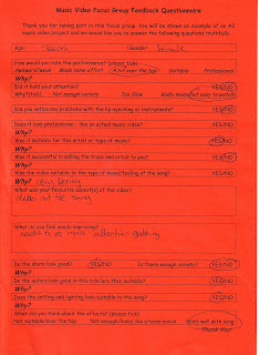

Group Feedback Questionnaire - Group One

From looking at this questionnaire feedback, we can see that we have received negative as well as positive feedback. Our music video seemed to hold their attention, and we think having both performance and narrative in the video helped this. The first criticism they gave was that it didn't sell the track or artist to them, however they didn't leave any reasons why they thought this. We think that this is simply their opinion as maybe they do not like this genre, as we have stuck to the typical conventions in an anti-folk music video. Their favourite part of the video seemed to be the tracking of the bicycle and we felt this was also our favourite bit as it was smooth and looked professional. They also said that they felt the camera angles and framing needs to be improved. We also agree, especially as we thought the walking parts were badly framed.
Audience Feedback - Average Score
After showing our completed music video to our media studies class, they marked us out of 40, giving us exact scores and the level boundaries in which our scores lie in. Here are our marks:
31
34
40
38
36
34
35
30
34
29
32
28
36
When we added these numbers together, we had 437. We then got an average by dividing it by 13 to get 33.6 which we rounded up to 34 which is our average mark out of 40.
31
34
40
38
36
34
35
30
34
29
32
28
36
When we added these numbers together, we had 437. We then got an average by dividing it by 13 to get 33.6 which we rounded up to 34 which is our average mark out of 40.
Finished Music Video - Positive Feedback
Now we've completed our music video, we can give ourselves feedback on how we feel the final product looks. This negative (previous post) and positive feedback (this post) is not a thorough evaluation and is simply a few thoughts on the completed music video. Although there are a few things we do not like about the video, there are many things that we are happy about. After watching other members of the class' videos, we noticed that some of their lip synching wasn't completely neat so we spent a long time on making sure ours was on time and looked convincing. We feel that the lip synching is actually one of the strongest parts of our music video, and we are very happy with this. Whilst filming, Rosa was always singing along with the soundtrack so when we decreased Rosa's volume on iMovie, it looked as if she was singing Kimya Dawson's lines. Another positive thing we noticed from the video is the cycling parts. Although originally we felt that it may be difficult to get smooth shots of Rosa cycling, we feel that actually the bicycle parts look very effective and smooth. The setting also contributed alot to the video, and we feel that it has made the video more effective and interesting.
Finished Music Video - Negative feedback
As you can see from the previous post, our music video is now complete. We are very happy with final outcome, however there could have been improvements if we had a longer amount of time on the project. Firstly, the walking parts where rosa is delivering newspapers whilst singing, turned out very jumpy and not smooth. Although this gave the more personal effect as if you were part of the scene, I would have much more preferred it if we hadnt have used a monopod and maybe something to get a smoother shot. We did, however, run out of time to film and we ended up sticking with it. This problem was not major, yet it would have looked more professional if it was done differently. The second problem was the lighting in some of the shots. The indoor shots were slightly unclear, and although we made sure we focused the camera, it was a bit dark compared to the outside shots as we did not have the natural sunlight. This also happened because Rosa's bedroom did not have a ceiling light so the only light produced in the room was from her bedside lamp. Maybe if we had filmed again, we would have placed another light in the room to make the shot more clear.
Tuesday, 24 January 2012
Beginning
For the beginning instrumental of the song, we had 14 seconds with no footage. After getting some shots and putting them in, we realized that we had too much footage and we didn't really want to delete any of the shots. To overcome this problem, we have put some shots, such as Rosa shutting the door, before the song starts so we dont have to delete anything we wanted originally.
Editing
Today, we came in to media studies early in order to put some extra time into editing and sorting out our video. After importing the footage from our last filming session, we decided to split the whole 30 minutes into various shots so we could just put them in place in the video. Although we didn't use all the footage from yesterday, we've been through and chosen the best shots and kept the others just incase. The video is nearly complete in the sense that we have inserted all the clips we need, however we still need to edit them (saturation and sepia tint) which we will do in our next lesson.
Filming
When we originally filmed the cycling bit a few weeks ago, we had many problems such as Rosa not being able to cycle properly. As this happened, we had to re-shoot it, as well as the introduction to the music video. This time seemed to go so much better as Rosa seemed smoother and more confident on the bicycle. To fill the interludes and other sections where we feel the shots are too long and need to be broken up, we incorporated a few close up shots such as Rosa 's feet cycling. These produce variety and make the video seem more interesting. From looking at the footage, I feel that yesterday's shoot went extremely well, and the only problem we had was that some of the first shot was cut off when we imported it onto the computer.
Thursday, 19 January 2012
Filming the Walking Section
After deciding we were going to film Rosa walking aswell as cycling, we went out to the estate next to college and filmed on a monopod which attaches to your jeans and keeps the camera steadier than if we simply handheld the camera. Although watching it back it seemed wobbly and not as smooth as the cycling parts, we have decided to use it because we quite like the fact its slightly jumpy. This effect gives it a quirky fun feeling and makes you feel as if you are part of the action. To film this section, we had Rosa learn all the lyrics then filmed her singing the whole song various times in different camera shots. Overall, this filming shoot went well and we feel as if we are getting somewhere with our project.
Thursday, 12 January 2012
Filming The Bicycle Section
On Saturday Jacques & I went to Wollaton to film the sections where Rosa is riding the bicycle. We gathered together around 6 extras which we first individually filmed having a newspaper thrown at them then did the tracking shots when Rosa is riding the bicycle. The individual shots worked out really well, however when we started the cycling parts, it went very wrong. The first problem we had was that Rosa had difficulty actually cycling and throwing the newspapers, and she often went off of the camera. A few times she nearly fell off of the bicycle. Although we'd previously asked her if she could cycle and
she said yes, I think she just had problems getting the newspapers out of the bag and throwing them furiously towards the extras. The car idea, however, worked really well and was smooth in how it moved with Rosa cycling behind. As the cycling idea seemed to fail on several occasions, we have decided to have parts where Rosa is walking instead of cycling as this will be easier for her. These will be two separate occasions on two different streets. Also in the introduction we will have her leaving the house and getting ready for her paper round twice, so the first one will be Rosa getting on the bicycle and cycling down the drive and the second one will be Rosa slinging the bag over her shoulder and walking down the drive.
she said yes, I think she just had problems getting the newspapers out of the bag and throwing them furiously towards the extras. The car idea, however, worked really well and was smooth in how it moved with Rosa cycling behind. As the cycling idea seemed to fail on several occasions, we have decided to have parts where Rosa is walking instead of cycling as this will be easier for her. These will be two separate occasions on two different streets. Also in the introduction we will have her leaving the house and getting ready for her paper round twice, so the first one will be Rosa getting on the bicycle and cycling down the drive and the second one will be Rosa slinging the bag over her shoulder and walking down the drive.
Tuesday, 20 December 2011
A2 Advanced Portfolio: Reflective Evaluation on CD Cover
Question One
 |
| Outside design of our CD cover |
 |
| Inside design of our CD cover |
 |
| Kimya Dawson's Album - Alphabutt (Front Cover) |
 |
| Kimya Dawson's Album - Alphabutt (Back Cover) |
 |
| Kate Nash's Album - Made of Bricks (Front Cover) |
 |
| Kate Nash's Album - Made of Bricks (Back Cover) |
From looking at the existing media products by Kimya Dawson, the 'Made of Bricks' CD cover and our own CD design, we can tell that there are clear links between aspects such as font and layout. The title on every front cover is at the top as this is the first place we look so we can identify the artist easily. The font used on Kate Nash's album cover is very similar to the one we have used (Beautiful Every Time) as it is very quirky and looks as if it has been written by a child. This gives a very light hearted effect representing the artist as fun which is good as Kimya Dawson does not take herself too seriously. On the cover of 'Alphabutt' the design on the back cover is the same as the front however the animals are not there. This is similar to our cover as we have the same back cover as the front, just without the model present. We liked this idea as it showed continuity in the theme. After receiving some feedback from our teacher telling us that the model was too small on our CD Cover, we looked at a few other CD Covers such as Kate Nash's album cover and saw that the model on there was also fairly small, so we have decided to keep it like this.
Subscribe to:
Posts (Atom)