Images and Logo
How is your band/artist represented?
On the opening page of Emmy the Great's website there are a lot of images, such as the dinosaur at the top of the page next to her name - instantly relating to Kimya Dawson's use of animals.This also links to the genre of anti-folk with the care-free, childlike representation. There are also several images with links to seperate pages which Emmy had blogged about of all sorts of things. The photo of the album cover is also on the opening page, which instantly allows us to see her latest work.
Genre
How are generic convetions of the music used?
Unlike Regina and Kimya's websites, Emmy the Great's is quite busy, with links running across the top, down both sides and at the bottom of the page; this slightly goes against what we would expect from this genre. However the colours used are very simple browns, beiges and blacks which we would expect to see.
New Technology and Links
How does your artist use media technology for promotion?
Emmy's website is very aware of how times have changed, with links to her Facebook, Twitte and MySpace on the bottom of every page.There is also an entire page with links to amazon and iTunes to download her albums and singles. And a page for videos of songs/artists she is a fan of herself.
Colour and Style
What does the overall colour and style say about the artist?
The simple use of browns, beiges and black borders allows us to relate the artist to the anti-folk genre, the 'earthy' colours tell us how down to earth Emmy is. Although this website contrasts to the simple, basic sites we'd expect to see from the genre with it being busy, the simple font and text brings us straight back to our expectations.
Written Content
How does the written style reinforce the artist's image/genre?
On first looking at Emmy the Great's website and looking into the written content, it appears to be fairly formal. However when looking deeper into some of the blogs she has posted we see that actually, she's very informal. With a blog entitled 'How to pretend you're having a good time' and several different ways, written in a very laid back and chatty way.
Font and Layout
How do they construct the artist's image?
The simple and plain font used throughout the website shows us how again, Emmy isn't too bothered about having outrageous and fancy fonts - just like Kimya and Regina - however the amount of text contrasts majorly to the other two previously analysed. The hand written and animal images as titles is also a generic convention to the genre and something we would expect to see.
Target Audience
What techniques are used to target the audience?
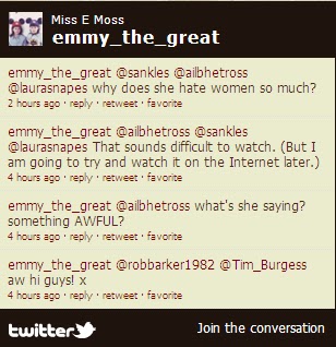
The informal use of language and constant reference to blogs, twitter, facebook and myspace amongst every page is perfectly suited for the target audience. The small chat forum at the side of the screen saying 'join the conversation' is also ideal for the target audience. Emmy is obviously in touch with her fans and likes to hear from them. The page given to downloading her albums, EP's and singles rather than buying a hard copy of her albums also show's that she is aware that her fans are mroe likely to download her music rather than buy the hard copies.
Advertisements
Are the advertisements suitable for the target audience?
Advertisements are all over Emmy the Great's website and are all suitable for the target audience things such as facebook, twitter, blogs pages, chat forums etc and advertisements for her live performances - which obviously her fans will go to - are easily accessible and simply worded for everyone to take note of and use.


No comments:
Post a Comment